
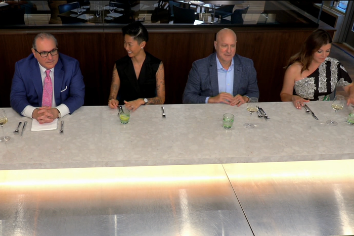
Would you care for a steep overhead shot of the judges that shows us more of the table than their faces? Photo: Bravo
Top Chef is back, and it’s in reinvention mode. Season-ten winner Kristen Kish is our new host. Quickfire challenges no longer win cheftestants immunity. There’s a cheese case in the kitchen. And once the chefs start cooking, it all looks a little … off, the composed camerawork and patient editing of previous seasons giving way to a jittery visual style that is more irritating than immersive.
In honor of the show’s new setting, allow me to be “Midwest Nice” here: Why? The only thing a Top Chef premiere needs to do effectively is introduce us to the latest competitors and to their food. But the newly hyperactive and discombobulating visuals in “Chef’s Test” actively prevent this.
Top Chef uses Kish’s arrival to suggest the show is entering a funkier, fresher era, both in terms of gameplay for contestants and episode structure for viewers. But the growing pains are awkward. The premiere episode skips a Quickfire, meaning viewers only get one opportunity to get a sense of the chefs’ cooking preferences and creative processes, and isn’t consistent in identifying contestants by name via chyrons. Dividing the chefs into three groups that must individually tackle the elimination challenge set by each judge — Kish wants soup, Gail Simmons wants stuffed pasta, and Tom Colicchio wants roast chicken — gives the episode a disjointed feeling, especially as the contestants talk about their dishes not in the familiar talking-head segments, but mainly by yelling random details about them to each other as they cook in the cramped kitchen of Milwaukee’s Lupi & Iris. “Chef’s Test” becomes actively unpleasant to watch in these scenes, as the camerawork abandons the polished feel of previous seasons and leans into a distracting voyeuristic approach.
The overall effect is like Top Chef’s creative team watched The Bear and decided to mimic the camerawork in the virtuosic “Review” and “Fishes,” overlooking that the technical precision of those episodes is more impressive than their sense of frenzy. Or maybe they binged Mr. Robot (something I normally would not object to!) and got so hyped about that series’ experimentation with the rule of thirds and Dutch angles that they decided to do all of it, too — all at once. Both of those shows work visually because their camerawork and cinematography serve the themes of their stories (isolation, conflict) and help develop characters’ internal lives and dramatic tensions within those abstract environs. But Top Chef has always been a dramatic environment by virtue of its reality. Tension naturally bubbles up in how the chefs race around the Top Chef kitchen, Whole Foods, and whatever event they’re catering or restaurant they’re cooking in; how they deal with screaming-hot stovetops, oil-splattering deep fryers, and ultrasharp knives; and how they butt heads during team challenges or criticize each other in front of the judges.
The series’ cinematography has never really needed to add to the inherently agitated atmosphere, and the look of Top Chef has been a grounding constant amid ever-changing locations and challenges. Quickfires rely on semi-wide shots to show everyone prepping at their stations, and on planting the camera in front of the grills or in the pantry to capture contestants running to and from those places. During eliminations, we get talking-head interviews where chefs walk us through their dishes, in-kitchen scenes where they gab with Colicchio, and static close-ups of knifework or plate assembly. Judges’ Table switches between head-on shots of the judges and the contestants for an unfettered presentation of what the judges thought about the food and how the chefs explain themselves. Until now, the show’s visual style has changed only when necessary, like when Top Chef: Portland switched to a chef’s-table Restaurant Wars concept during COVID and incorporated more elevated shots to show both the chefs in the background, either collaborating effusively or in awkward silence, and the judges in the foreground, assessing how the team worked. Otherwise, Top Chef has looked fairly predictable because it doesn’t need manufactured spectacle — until “Chef’s Test.”
The off vibes start at Whole Foods, where certain moments in the shopping montage are blurry before dramatically coming into focus a few seconds into the shot, as if contestants dashing around wasn’t already fevered enough. They get drastically worse when the chefs start pouring into the kitchen of Lupi & Iris, which “Chef’s Test” treats as an obstacle course for its camera operators. Nearly every other shot here has an obstruction in its foreground (stacks of plates, pots and pans, wire shelving, hotel pan lids, prep tables):
Or is shot through an impediment (the frame of pass-through windows, glass partitions separating portions of the kitchen from the dining area):
The frames are composed with some kind of extreme angle (around a corner, over people’s shoulders, a fish-eye above the competitors, a steep overhead shot of the judges that shows us more of the table than their faces, an angled shot from underneath a competitor so we practically look up their nose) …
… Or in context-less close-ups (a food processor, a blender, a cutting board), or with a super-shallow depth of field (chopping hands, a line of miniature ovens sitting on a counter, a ticking clock … twice).
Would you like a shot of a competitor’s head turned away from the camera, with little else in the frame? You can have that twice, too!
I’m not trying to say that Top Chef should never play around with how it looks, but change, like a soup, a pasta sauce, or a roast chicken, needs time to simmer, to develop flavor. “Chef’s Test” feels rushed like an underdone risotto, removing a challenge that would help to personify its contestants, cramming everyone into a compact space, sporadically jumping around from person to person, and unleashing an ocular assault that is more about flash than a focus on these competitors and their dishes. And I cannot say “yes, chef” to that.
https://news.google.com/rss/articles/CBMiU2h0dHBzOi8vd3d3LnZ1bHR1cmUuY29tL2FydGljbGUvdG9wLWNoZWYtc2Vhc29uLTIxLXByZW1pZXJlLW5ldy1sb29rLWV4cGxhaW5lZC5odG1s0gEA?oc=5
2024-03-21 19:54:01Z
CBMiU2h0dHBzOi8vd3d3LnZ1bHR1cmUuY29tL2FydGljbGUvdG9wLWNoZWYtc2Vhc29uLTIxLXByZW1pZXJlLW5ldy1sb29rLWV4cGxhaW5lZC5odG1s0gEA
Bagikan Berita Ini


0 Response to "Why 'Top Chef's New Season Looks So Different - Vulture"
Post a Comment